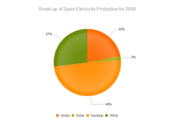
Pie Chart
The Pie Chart displays a single series of data as sectors within a two-dimensional circle and is useful for displaying data as parts of a whole.
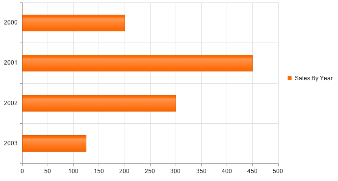
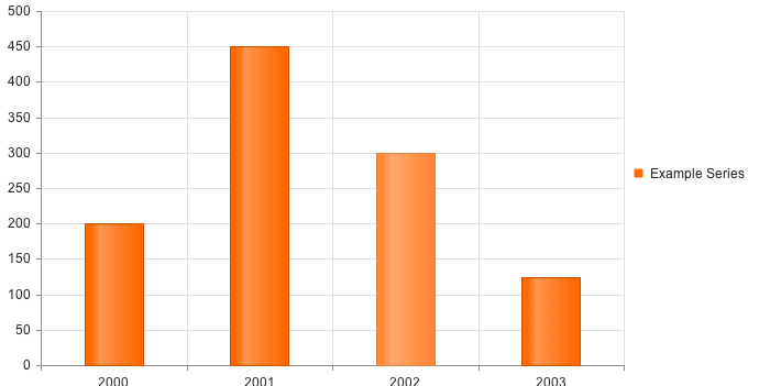
Bar Chart
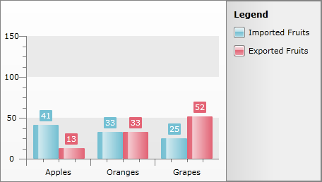
A Bar Chart displays data as horizontal or vertical bars whose lengths vary according to their value. You can use a Bar chart to show a comparison between several sets of data (e.g. summaries of unique and total site visitors for a certain period).
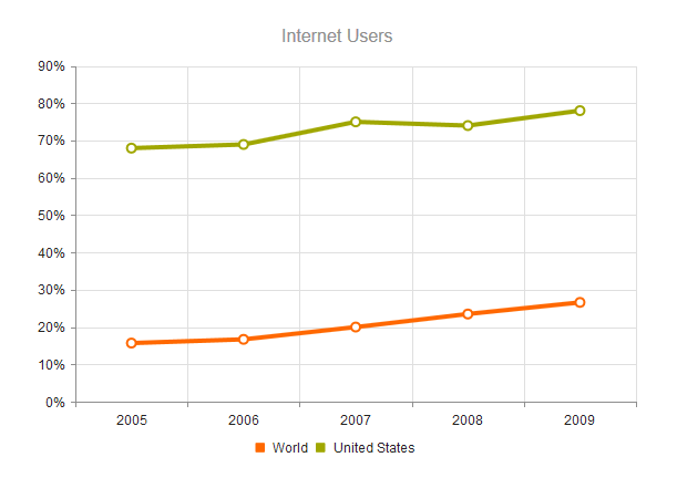
Line Chart
A Line Chart displays data as continuous lines passing through points defined by their items’ values. It can be useful for showing a trend over time and comparing several sets of similar data.
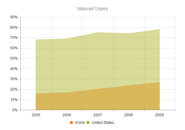
Area Chart
The Area Chart is suitable for displaying quantitative data as continuous lines passing through points defined by their items’ values. The portion of the graph beneath the lines is filled with a color according to each series. The different colors in an Area Chart are useful for emphasizing changes in values amongst multiple sets of similar data.
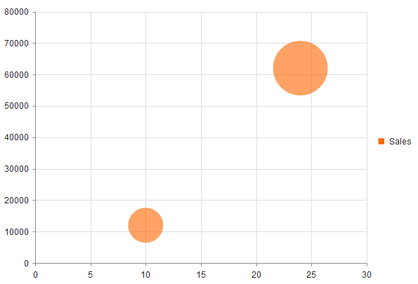
Bubble Chart
A Bubble Chart display data points as coordinates, with the bubble size defined by the items’ value. Similar to the Scatter Chart which replaces the data points with bubbles. The Bubble Chart is unique by displaying three-dimensional data — two values for the items’ coordinates and one for their size. It’s particularly useful for visualizing different scientific relationships (economic, social, etc.). This chart type’s x-axis is also numerical and does not require items.
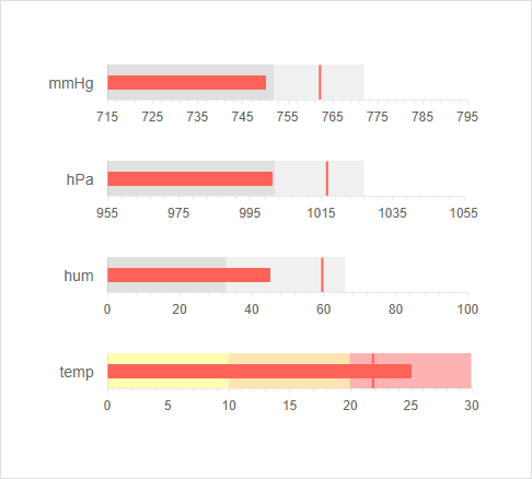
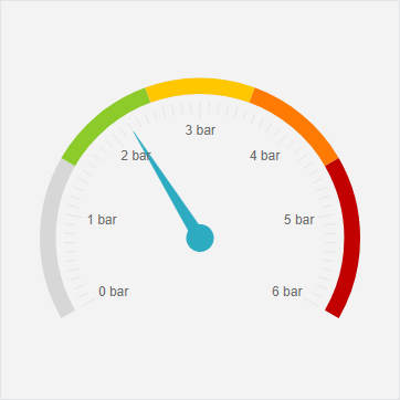
Bullet Chart
Bullet Chart is a variation of a Bar Chart and can be used as a replacement for dashboard gauges and meters. The bullet graph compares a given quantitative measure (such as temperature) against qualitative ranges (e.g. warm, hot, mild, cool, chilly, cold, freezing, icy, frosty) and a symbol marker that encodes the comparative measure (e.g. last year’s max temperature). It’s also useful for actuals vs. forecast reporting.
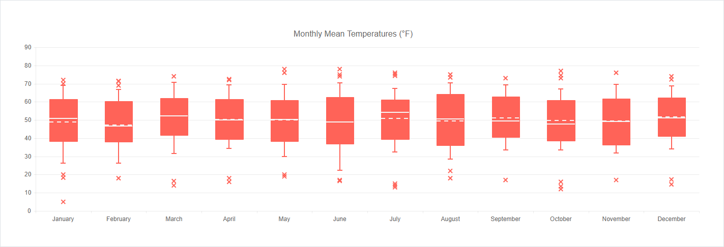
Box Plot Chart
The Box Plot Chart is useful for comparing distributions between different sets of numerical data. It depicts graphically numerical data by displaying a data distribution summary with six indicators (lower value, first quartile, median, mean, third quartile, upper value) and outliers for each set of data.
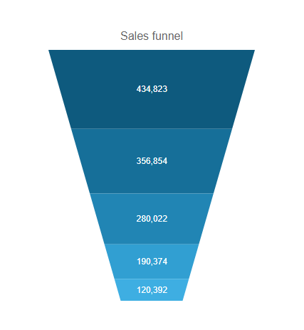
Funnel Chart
The Funnel Chart displays a single series of data in progressively decreasing or increasing proportions, organized in segments, where each segment represents the value for the item in the series. The items’ values can also influence the height and shape of the corresponding segments.
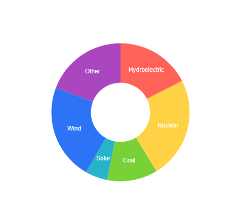
Donut Chart
The Donut Chart displays data as sectors from a circle. It is a variation of the Pie Chart (which displays a single series of data in a two-dimensional circle). It is useful for displaying data as parts of a whole.
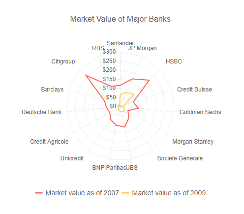
Radar Chart
The Radar Chart type series is represented on the chart as data points connected with a straight line and wrap the x-axis in a circle or polygon.
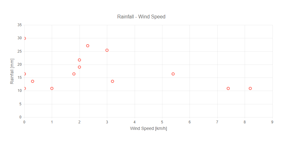
Scatter Chart
The Scatter Chart displays data as points defined by their items’ values. Scatter charts are useful for showing the relation between different sets of data, for example scientific (experimental) results.
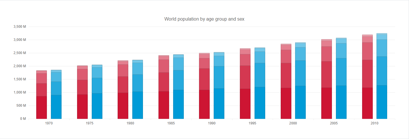
Stacked Bar Chart
A Stacked Bar Chart, just like the Bar Chart, displays data as horizontal or vertical bars whose lengths vary according to their value. However, the Stacked version is useful for identifying the proportion of individual values to the total.
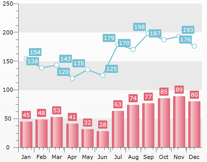
Multi-Series Chart
The Multi-Series Chart displays two or more charts bound to different data series in the same chart area. Usually these data series are semantically related and joining them together enables the user to more easily compare the values.
Categorized Chart
In the Categorized Chart the x-axis can be used to plot both values (e.g. number of sales) and categories (e.g. months of the year, units, people).
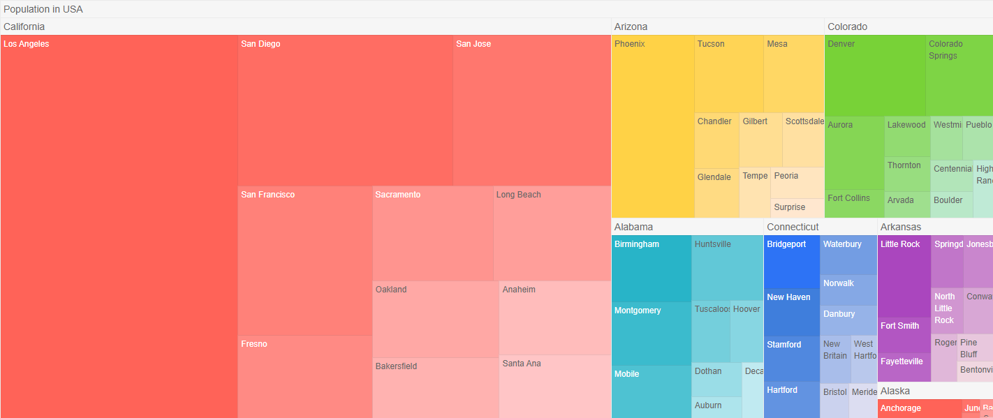
TreeMap
The TreeMap perfectly suits visualizing hierarchical data in a traditional tree structure. The extension provides three options (squarified, horizontal and vertical) for displaying data.
The main advantages of this control:
- Visualize huge data in a meaningful and colorized way (i.e. files system structure divided by size; the popularity of different tech devices on the market, and other)
- Optimize space on your webpage due to its compact structure
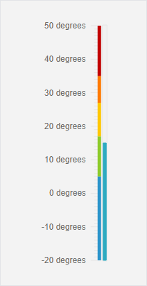
Linear Gauge
The Linear Gauge represents the ranges and the values in a linear format, as its name suggests. It can be explained simply as a thermometer – the pointer is the quicksilver that fills the tube and the ranges can represent the temperatures in which we feel cold, hot, or simply fine.
Radial Gauge
Radial Gauge represents the ranges and the value in a circular format, much like a car dashboard. In a similar manner it offers a customizable dial and a pointer, that rotates around its cap to show the value on the scale.
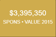
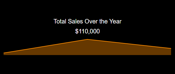
Tile
Sometimes a single number is the most important thing you want to track on your dashboard or report, such as total sales, market share year over year, or total opportunities. This type of visualization is called a Tile.
Sparkline Tile
A Sparkline Tile combines the Tile functionality with a very small chart visual, drawn without axes, coordinates, legend, title nor other chart-specific elements.
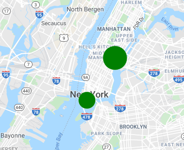
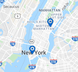
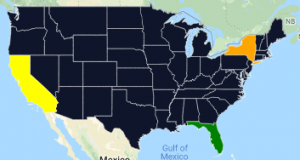
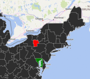
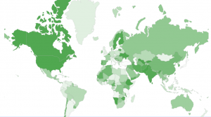
Map
The Map enables layering (e.g. bubbles, markers) and color-coding locations, plotting data based on address, zip code, city, and latitude/longitude values. You can also import your own custom map Layers to divide maps into custom sections.
Location and Layer Types
Location Types:
Latitude/Longitude – A combination of Latitude and Longitude, e.g. ‘38.889931’ as Latitude, ‘-77.009003’ as Longitude
Postal Code – postal code of the area, e.g. 10005
City – City name, e.g. ‘New York’
State – State name, e.g. ‘California’
Layer Types:
Bubble – Size depends on value and supports dynamic color
Marker – Icon for specific point; does not support dynamic color
State – Fills state/province shapes as defined by standard maps; supports dynamic color
Designated Market Area (DMA) – Fills the industry standard DMA regions within states
Shape Fill – Utilizes a layer of custom polygons; must be defined with a GeoJSON format and map from the dataset in the Json Coordinates field
Additional Display Options:
Tooltip HTML – Provides info for map data points; the user must click on the layer in order to display the tooltip
Dynamic Fill Color – Fills each bubble according to custom definitions
Location Type = Zip Code | Layer Type = Bubble
Location Type = Zip Code | Layer Type = Marker
Location Type = State | Layer Type = State
Location Type = State, Layer Type = DMA
Location Type = State, Layer Type = Shape
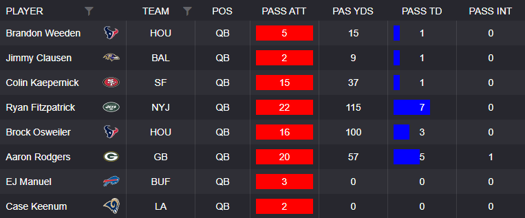
Table
The Table displays data in a tabular format. Additional table features include:
- Drag/Drop reordering of columns (by end users)
- Hide/Show columns (by end users)
- Sorting
- Filtering
- Conditional Formatting
- Saving customized view of table (which incorporates the most recent sort, filter, and column order)
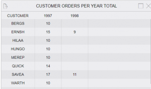
Matrix
The Table displays data in a tabular format, but the number of columns and rows are dynamic and controlled by the data.
KPI Card
KPI Card displays multiple KPI metrics.
Left part of the KPI Card displays an optional image. The right side integrates the desired KPI metrics for monitoring. Features include conditional formatting for the outer rim of the card and the KPI metric itself. A mouseover tooltip is also available to display values.
Scorecard
Scorecard is a specific visual type which works best when comparing several metrics side by side. Optional image headers can be used.
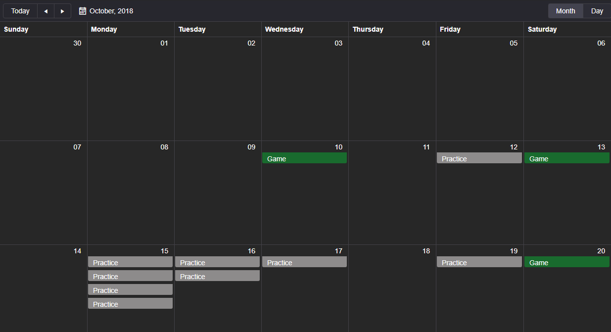
Calendar
Calendar displays one or more events. It supports two modes – Month View and Day View. With any event you can click to display detailed pop-up windows and/or drilldown to a new dashboard based on the day/event clicked. It supports color coding event types/categories.
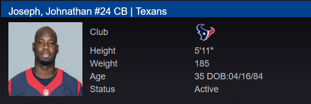
Card
Card displays basic information and the option for inclusion of an image. This can be used as a summary visualization on a dashboard.
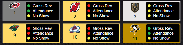
Board
Board is similar to Table but mainly differs in that Board categorizes items within groups and said group items are expandable to display additional data. For example, by clicking on a player’s name in the below Board displays more information on the player (can also expand/collapse all items by a single click). Conditional formatting is supported.
Media List
Media List is a visualization type which displays video, images, or PDF’s with playlist navigation and customized playlists, cut-ups, and/or favorites.
HTML Output
Visualization for displaying any type of HTML output. For example, embedding a web page or external report within RockDaisy

<HTML> Any Valid HTML code will be rendered within control </HTML>
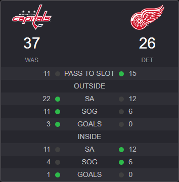
Zone Chart
The Zone Chart can show metrics and conditional formatting within pre-defined zones. This could be used in many ways, for example color-coded floor plans in a store to track sales, customer traffic, etc.
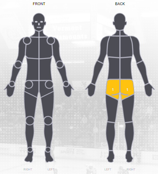
Body Part
A specific visualization type which represents body injuries or treatment.